Welcome to my Github page!
By: Kayla Sippin

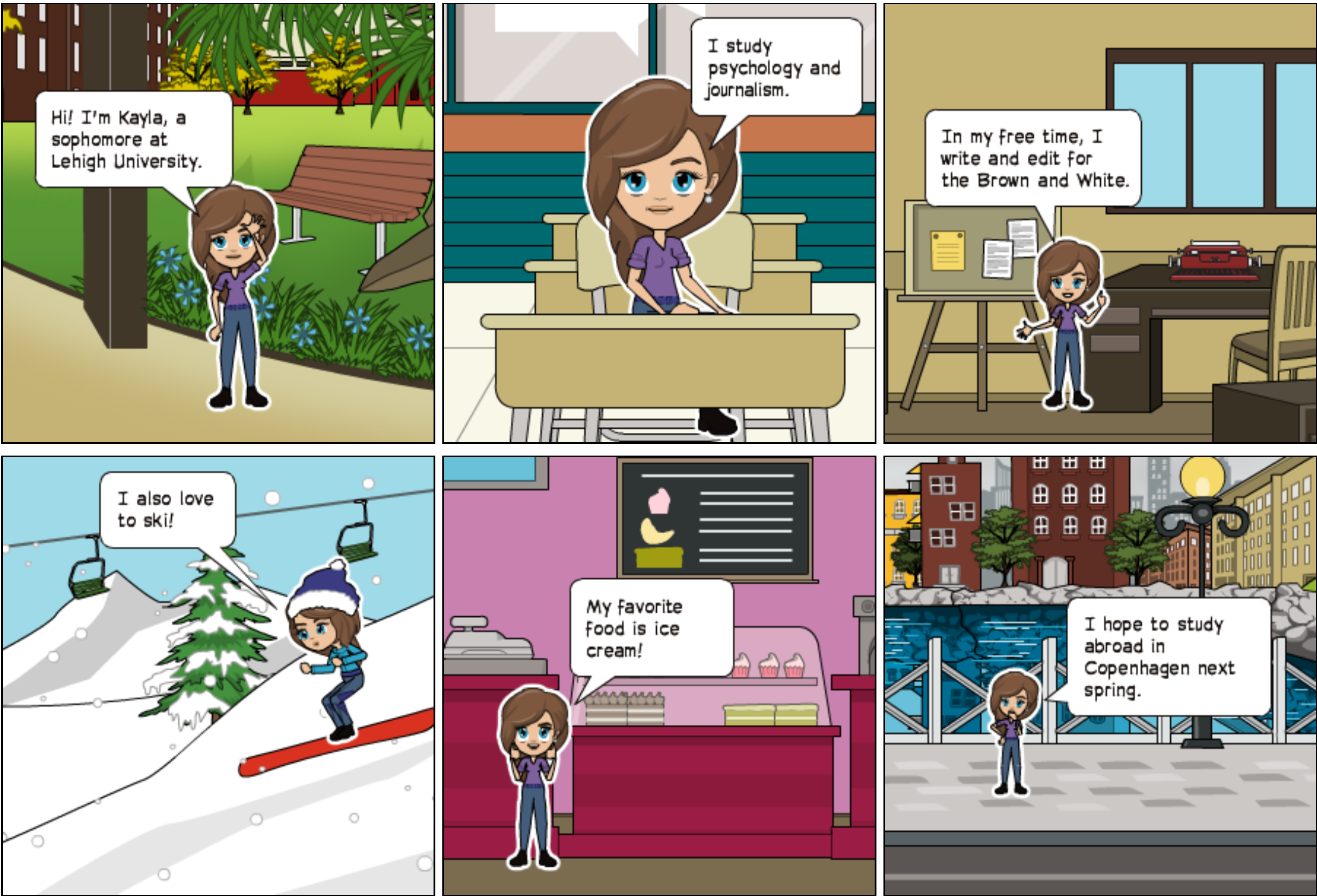
Hi! I’m Kayla, a sophomore, double majoring in Journalism and Psychology. In my free time at Lehigh, I write and edit for the Brown and White, play ultimate frisbee and I’m in Phi Sigma Pi. I’m excited to learn more about data visualization this semester! The data visualizations I’ve made throughout the semester demonstrate my interests - I’ve created visualizations about my favorite treat, ice cream, my favorite band Coldplay and skiing.
Comics
Made with Pixton
Infographics
Made with Canva
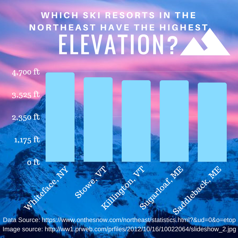
Skiing Infographic
This infographic shows the highest ski resort mountains in the Northeast, some of which I’ve been to.
Timelines
Made with TimelineJS
The formation and history of the band Coldplay
If I’m listenting to music, you’ll usually catch me listening to Coldplay. This timeline shows a history of when Coldplay formed, when their albums came out and information about their tours.
Charts
Made with Chartbuilder
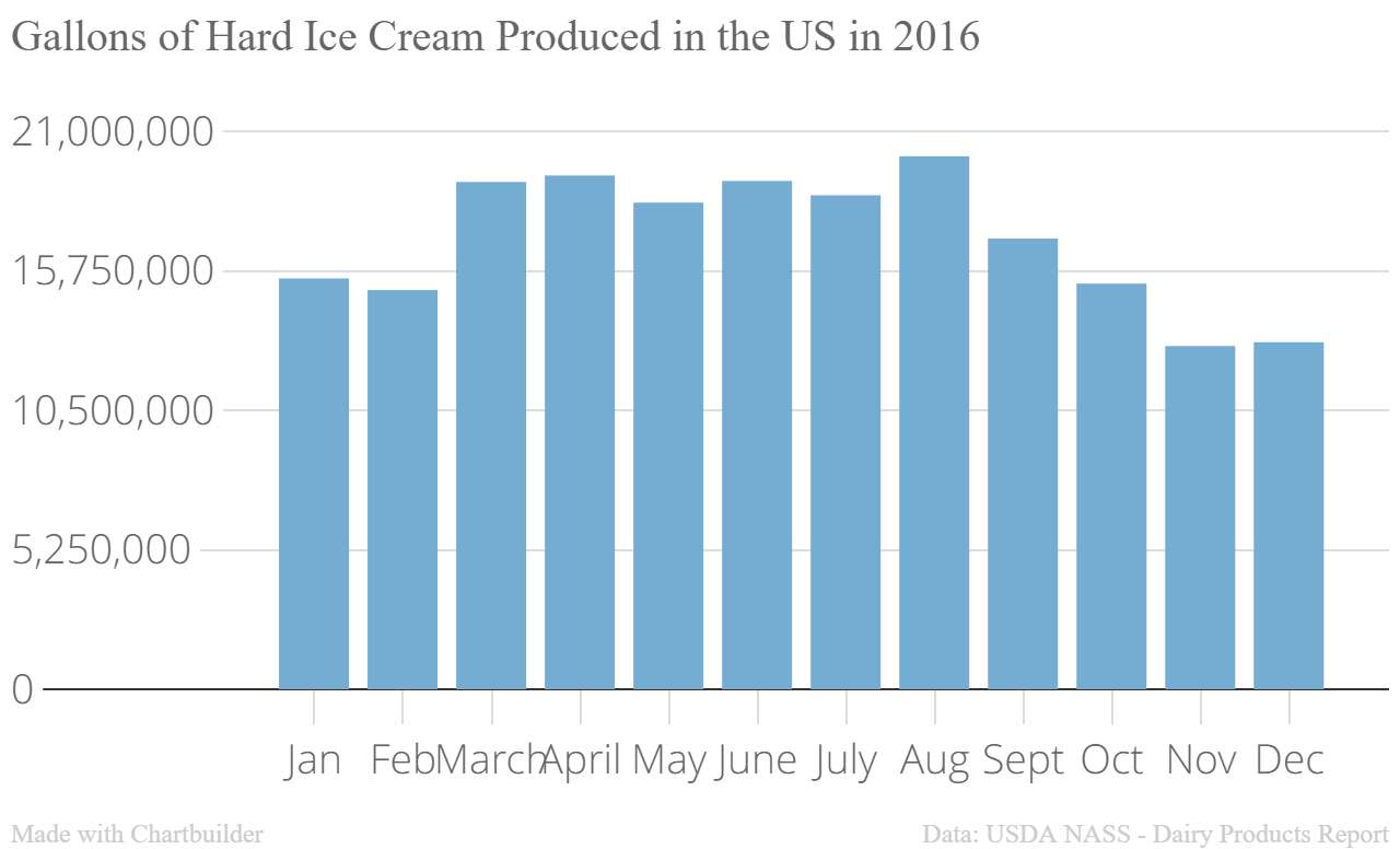
Ice Cream Production
This chart demonstrates the amount of hard ice cream produced each month throughout the year of 2016. Unsurprisingly, more ice cream is produced in the warmer months.
Maps
Made with Google Fusion Tables
Top Ice Cream Shops in the U.S.
My favorite food is ice cream, so I couldn’t help but make a map showing the top ice cream shops in the 50 U.S. states, some of which I’ve been to. The data is based on a list from The Thrillest.
Intertactive Datasets
Made with Tableau
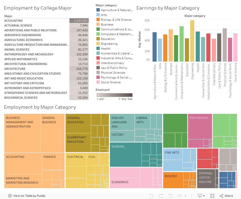
Employment and Earnings by College Major
This visualization shows the earnings and employment based on college major. As you can see, engineering majors make the most money, while there are the most people who work in the field of business. The data comes from the American Community Survey 2010-2012 Public Use Microdata Series.